Thanks for all your nice comments on my blog! This picture is great! I have a soft spot for sibling pictures. The only problem (for me anyway) is to get them to stay still long enough to get a decent picture! :)
Hey Stephanie! Thanks for stopping by my blog. I added you too!! Yeah, I like my Nikon, but there sure are more Canon lovers out there. So you can't really go wrong. Just get something that suits your budget!!
So, on another subject, I apparently have become a blog fix-it girl. I just showed Alicia how to get the border off of her new signature, and I have a helpful hint for you... and if you don't want it, just ignore me!! But IF you'd like more space on the left and right sides of your posting area (see how your words kind of slam right into your border?), there's a really easy fix. Go to Layout, then Edit HTML, and then scroll down until you see a section that looks like this... #main-wrapper { border: solid 5px #1670C5; width: 410px; float: left; word-wrap: break-word; /* fix for long text breaking sidebar float in IE */ overflow: hidden; /* fix for long non-text content breaking IE sidebar float */
Somewhere in that section (like right below "width: 410px;"), add these two lines:
padding-left: 5px; padding-right: 5px;
Then push Save Template.
This should move your text away from the borders. IF you don't like how much it moved (or how little), go back and play with the numbers. I have my padding at 13, but your main area's smaller already, so you might not want that much. You don't have to have the left and right the same number either.
Sorry, I don't even know you and I'm telling you what to do! : ) I feel like I'm the blog version of the Geek Squad! Just saving one blog at a time! haha
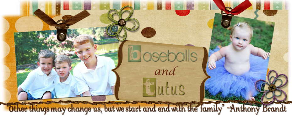
I am a SAHM to three wild boys and one precious little girl. I'm trying to raise my kids the best way I know how and somehow make it through the insanely long days when I could possibly be called certifiable.


13 comments:
Aww he's loving on his sister and she is loving it too!
Precious! Hope you have a great day!
How precious is that?! Love it!
So sweet!
awww love to see the love
So so cute!
Thanks for all your nice comments on my blog! This picture is great! I have a soft spot for sibling pictures. The only problem (for me anyway) is to get them to stay still long enough to get a decent picture! :)
Tickle, Tickle, how sweet.
so so cute!!
just noticed that the gal before me stole my comment :)
I love this picture! The look on her face is priceless.
Oh, I love it Stephanie!!! So cute!!!
Hey Stephanie! Thanks for stopping by my blog. I added you too!! Yeah, I like my Nikon, but there sure are more Canon lovers out there. So you can't really go wrong. Just get something that suits your budget!!
So, on another subject, I apparently have become a blog fix-it girl. I just showed Alicia how to get the border off of her new signature, and I have a helpful hint for you... and if you don't want it, just ignore me!! But IF you'd like more space on the left and right sides of your posting area (see how your words kind of slam right into your border?), there's a really easy fix. Go to Layout, then Edit HTML, and then scroll down until you see a section that looks like this...
#main-wrapper {
border: solid 5px #1670C5;
width: 410px;
float: left; word-wrap: break-word; /* fix for long text breaking sidebar float in IE */
overflow: hidden; /* fix for long non-text content breaking IE sidebar float */
Somewhere in that section (like right below "width: 410px;"), add these two lines:
padding-left: 5px;
padding-right: 5px;
Then push Save Template.
This should move your text away from the borders. IF you don't like how much it moved (or how little), go back and play with the numbers. I have my padding at 13, but your main area's smaller already, so you might not want that much. You don't have to have the left and right the same number either.
Sorry, I don't even know you and I'm telling you what to do! : ) I feel like I'm the blog version of the Geek Squad! Just saving one blog at a time! haha
Post a Comment